tldr
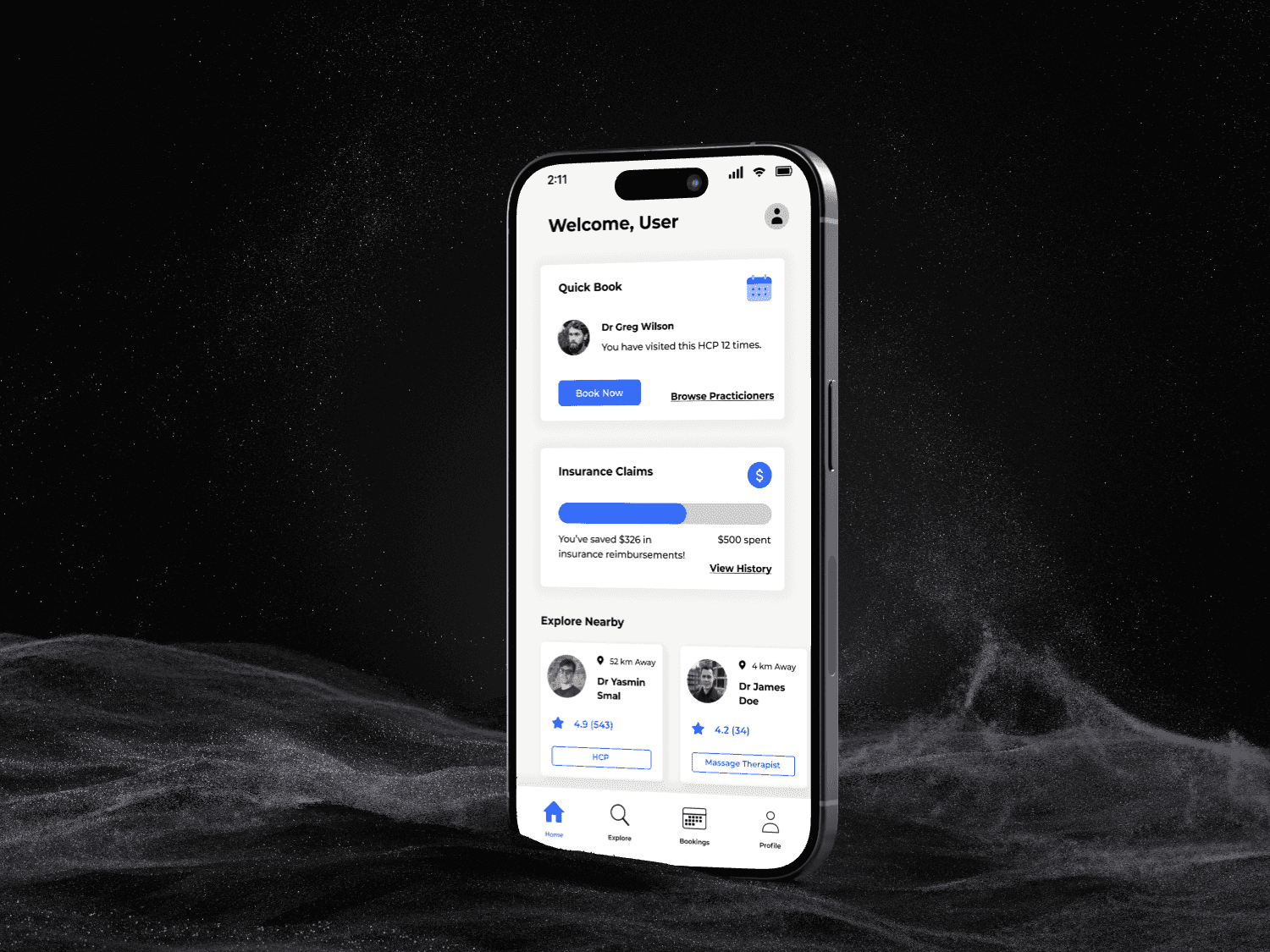
I was tasked with designing an app or website that would improve some aspect of the healthcare field. I chose to look at booking systems, and focus on how scheduling and paying for healthcare appointments could be automated. The solution was a mobile application.
background
the solution
the process
stage 1:
• competitive analysis with companies from different sectors.
• analyse a few of them in a deeper context.
• compile key insights & takeaways.
stage 2:
• create personas.
• speak to real doctors + patients
• use insights to determine pain points.• analyse a few of them in a deeper context.
stage 3:
• customer journey maps.
• define certain opportunities at each stage.
• rank key opportunities.• speak to real doctors + patients
key insights
Simplicity is the most essential part of crafting a streamlined booking service.
Users should not feel overwhelmed with options. Instead, highlight a few key tasks and make these easily accessible.
Minimal clicks is optimal in a booking process. Cliniko takes only 4 clicks to book an appointment. This is ideal.
Using these key insights helped me develop my over arching goal and hone in what the focus of the project should be. As opposed to trying to be a jack of all trades, a well made app would focus on getting the important things right.
The solution does not have to address every single problem and pain point. Rather than creating a one-size fits all, it should focus on a few key tasks and maximize efficiency and intuitiveness.

customer journey maps
The customer journey map shown below proved to be extremely useful in the context of this project. The opportunities identified helped design the user workflows (which will be explored shortly), and aided in understanding the true pain points that a user may face during the experience of booking and attending healthcare appointments.
user workflows
An essential and often overlooked stage in the design process is mapping out user workflows. Creating these helps understand the steps a user will take to perform tasks, and easily outlines where redundancies and pain points may be created. As well as this, it helps in the understanding of what the most important tasks and processes a user may want to perform are.
initial designs
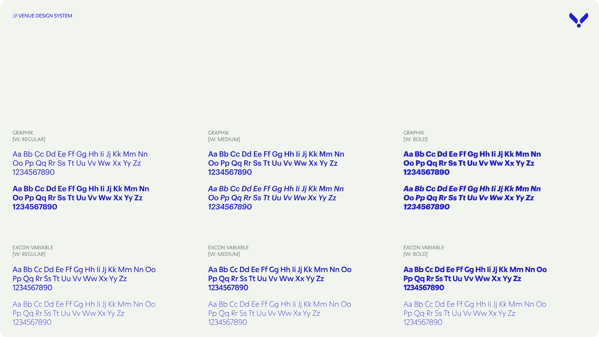
As any self-respecting, inexperienced designer would do, I jumped straight into the high-level design. No planning, no atomic design system and definitely no vision. Just me and a blank canvas.
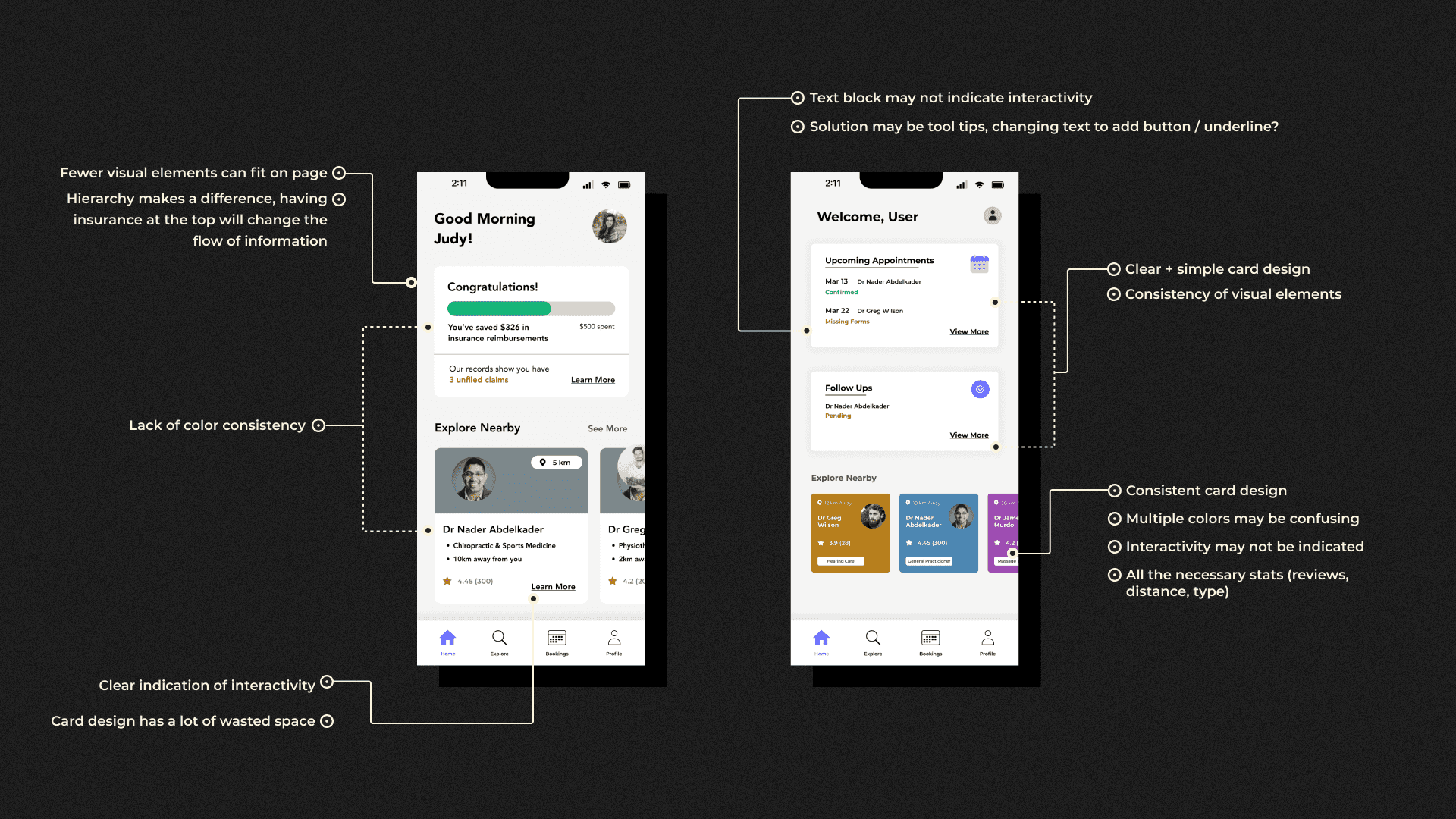
With that said, not everything that came out of this futile exercise was... futile. Instead, the design gave me the opportunity to analyse, to determine what was working well, and what could be improved. This would give me a greater idea of the direction I wanted to head in when I did things the right way.
user testing
rewrite
Insight 1:
Users would not pay attention to sign up process -- results in confusion when software offers to find a time
Insight 2:
Upcoming appointments is unclear in the bookings section - can it be added to the home screen?
Insight 3:
It was hard to remember appointment details -- final screen of booking flow not attention-grabbing
Insight 4:
An option to view scheduled appointments in a calendar view rather than list view would be nice
Insight 5:
When applying filters in the explore section, the apply filters button blocks out the addition of other filters
Insight 6:
In financial history, the use of green circles w icons doesn’t imply what’s going on -- needs more clarity

reflection
rewrite
Insight 1:
Users would not pay attention to sign up process -- results in confusion when software offers to find a time
Insight 2:
Upcoming appointments is unclear in the bookings section - can it be added to the home screen?
Insight 3:
It was hard to remember appointment details -- final screen of booking flow not attention-grabbing
Insight 4:
An option to view scheduled appointments in a calendar view rather than list view would be nice
Insight 5:
When applying filters in the explore section, the apply filters button blocks out the addition of other filters
Insight 6:
In financial history, the use of green circles w icons doesn’t imply what’s going on -- needs more clarity