timeline
timeline
2 weeks
2 weeks
client
client
modulize
modulize
role
web design
collaborators
Riccardo Busato
role
web design
collaborators
Riccardo Busato
role
web design
collaborators
Riccardo Busato


project details
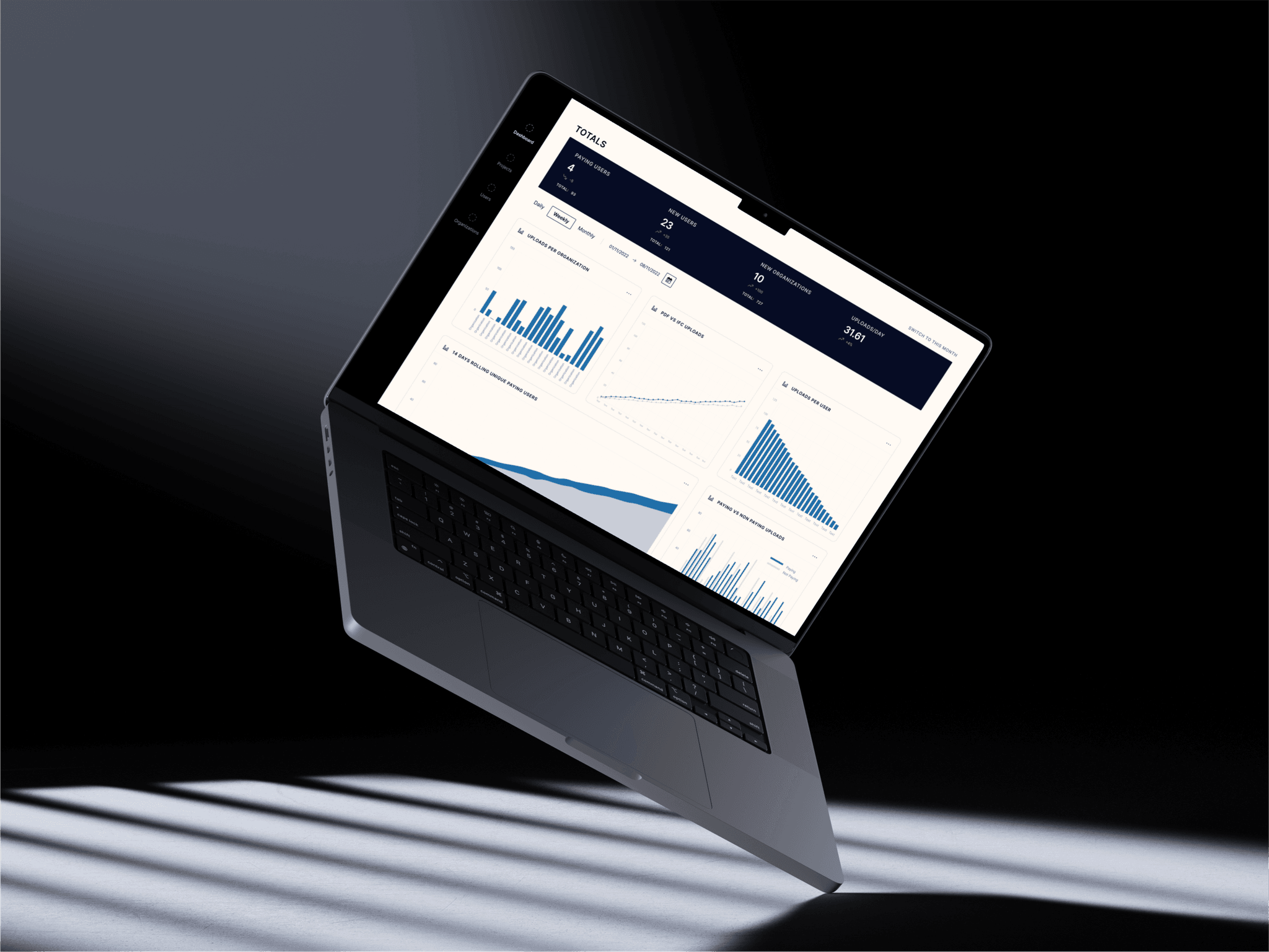
This project focuses on my redesign of the Admin Panel. The challenge was to improve the existing solution in a 2 week turnaround time, making meaningful changes but limiting it technically due to time constraints on the development side.
This project focuses on my redesign of the Admin Panel. The challenge was to improve the existing solution in a 2 week turnaround time, making meaningful changes but limiting it technically due to time constraints on the development side.
problem space
The scope of the problem space I was working in for this project was quite limited. The dashboard needed significant design and UX improvements, but a complete overhaul would be too time-consuming for the development team right now, so I had to walk a fine line between technical considerations and design requirements. The aim was to make the admin panel easier to use and navigate by solving UX issues, improving the visual design and hierarchy, and ultimately improving the experience.
The scope of the problem space I was working in for this project was quite limited. The dashboard needed significant design and UX improvements, but a complete overhaul would be too time-consuming for the development team right now, so I had to walk a fine line between technical considerations and design requirements. The aim was to make the admin panel easier to use and navigate by solving UX issues, improving the visual design and hierarchy, and ultimately improving the experience.
How might we improve the overall experience of the admin panel, while retaining the majority of the same functionality that currently exists?
How might we improve the overall experience of the admin panel, while retaining the majority of the same functionality that currently exists?
background
When redesigning any product, the best place to start the process is with the current system. An in-depth UX audit can help find flaws in a current system, highlight what’s working, and ultimately make the entire design process smoother.
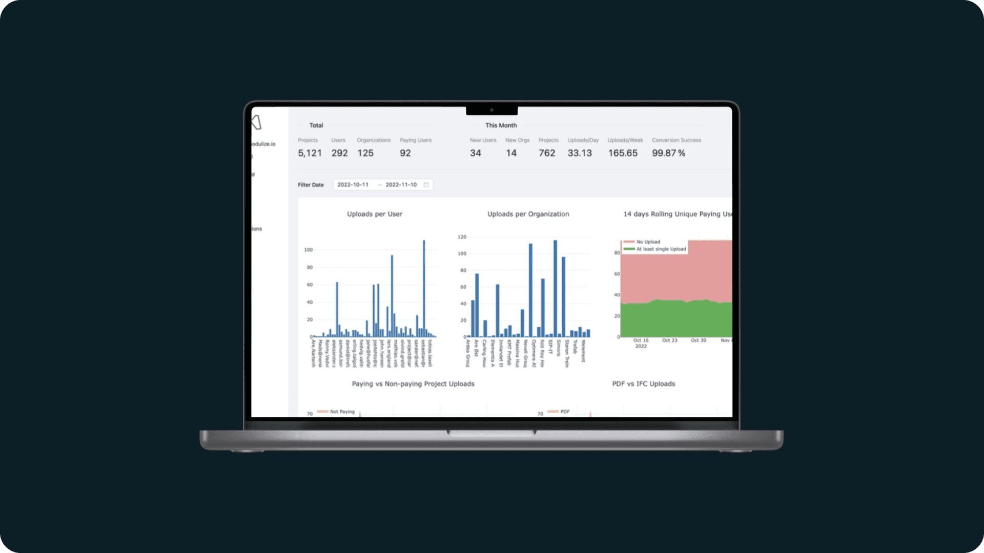
Currently, the admin panel is functional but lacks when it comes to design and thoughtfulness. The information is cluttered, and can be difficult for new users to navigate. The main focus is on improving the dashboard, as the remaining pages will be overhauled with the redesigned table component. This does not mean that the other pages can be ignored, merely that the focus will be on the dashboard and the other pages (users, projects, organizations) will be secondary.
A few takeaways from the UX audit:
• Information is cluttered and difficult to understand.
• The filtering tags do not work as expected; they only work for the graph directly beneath them.
• Graph colors are bland and dreary, making the entire experience more boring for users.
• Having so many 'key info' points at the top takes away the importance (Miller's Law).
• There is no visual hierarchy or flow on the page.
user stories
Although not always required, writing user stories can often help keep track of what problem you're trying to solve, and who you're trying to solve it for. In this specific case, almost all the user stories were centered around internal members of the team (admins) who were the only ones with access to the dashboard. Below are a few of the user stories I wrote.
As an admin, I want to be able to navigate easily around the admin panel.
As an admin, I want to see important information at a glance, without having to search around.
As an admin, I want to be able to find what I’m looking for easily.


research
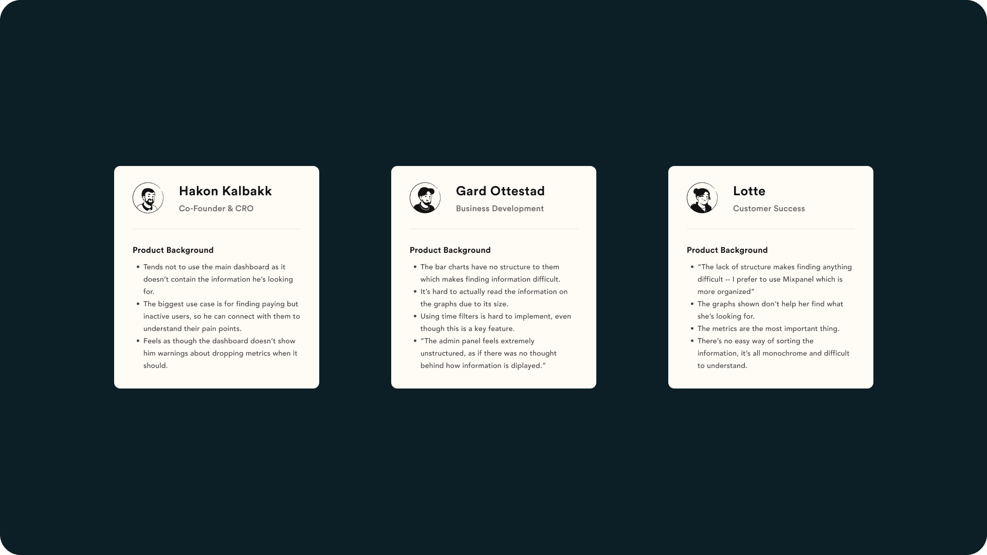
I’m a strong believer in including users in the entire design process, from start to finish. So, after completing my initial background research into the platform and its pain points, I began talking to some internal stakeholders and frequent users to gather some insights into how people were interacting with the admin panel.
My conversations with the users involved asking them a number of questions about specific elements of the admin panel, as well as asking them to walk me through a typical use of the dashboard. This proved to be extremely helpful, and quashed many assumptions I had unconsciously made myself.
"The lack of structure makes finding anything difficult"
Lotte, Customer Success
"I've been using the admin panel for over a year and I still get confused about where things are"
Gard, Business Development
"I skip the dashboard completely. It's easier to understand the tables on the other pages than try to make sense of the mess of a dashboard we have"
Hakon, Co-Founder


wireframe
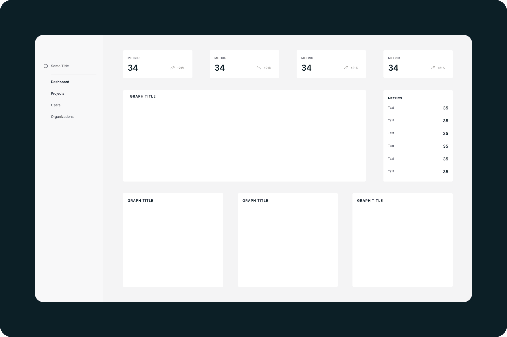
The insights I had gathered gave me a good starting point to begin sketching out some possibilities for an improved structure of the admin dashboard. The hardest part of the process was trying to build something that could scale. At the moment, we only measure a given amount of metrics, but as Modulize launches new features, this will certainly increase. The design needed to be completed in a way that allowed it to be flexible and scalable, while also addressing all the pain points the users had expressed.
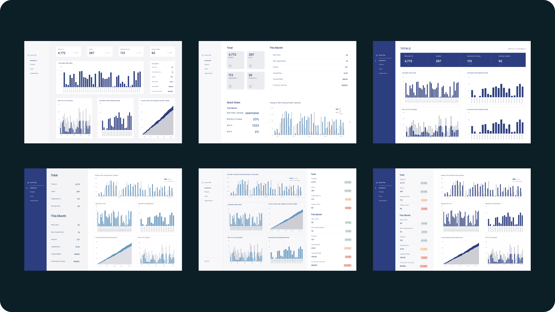
I began with low-fidelity wireframing on paper to sketch out sample structures and explore visual hierarchy. Once I had a few ideas that looked promising, I began to build out the structures on Figma using white cards on a grey background. This helped me to visualize it more clearly and understand how we can draw attention to certain parts of the screen.


designing
Having created multiple iterations of structure in mid-fi wireframes, the reasonable next step was to begin to populate them and see if the information could come together as hoped. I was using our existing design system colors and styles to create contrast, and pulling information from the existing admin panel. What I found as I began to do so was not only did everything come together seamlessly, but there were so many possibilities that it was difficult to narrow down. I referenced the user stories and technical constraints to ensure I was ticking all the boxes I needed to, but still could not decide on a singular design. There were simply too many options.


user feedback
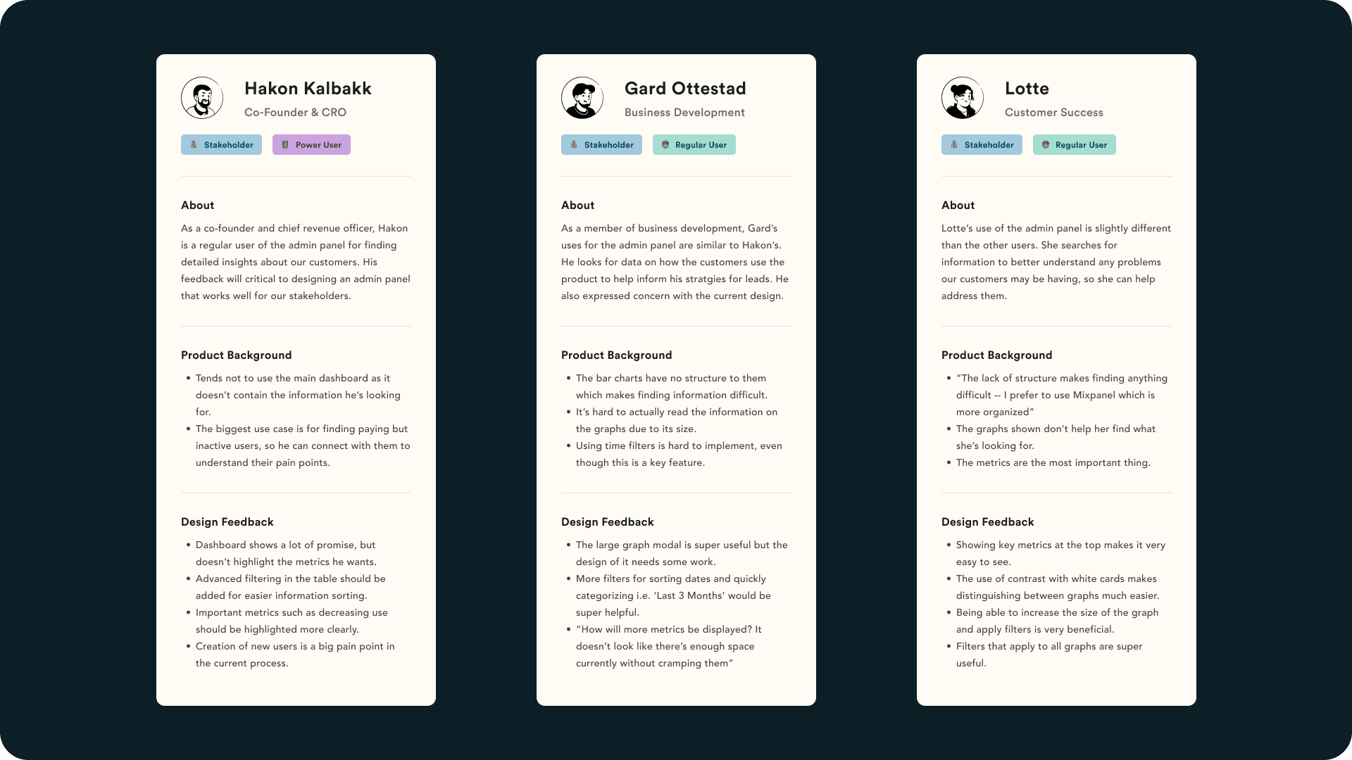
The only way to sift through and improve was to gather more feedback from the users, this time with designs on hand. I set up meetings with each of my stakeholders, and ran design reviews with each of them. The format this time was giving them control of my screen, and having them talk me through how they felt and how they thought it worked. I then asked them a few more questions, such as:
The only way to sift through and improve was to gather more feedback from the users, this time with designs on hand. I set up meetings with each of my stakeholders, and ran design reviews with each of them. The format this time was giving them control of my screen, and having them talk me through how they felt and how they thought it worked. I then asked them a few more questions, such as:
"Is there anything you feel is still missing?"
"If you had complete control over the design what would you change?"
"Is there anything you feel is still missing?"
"If you had complete control over the design what would you change?"
These mini-reviews provided a ton of invaluable feedback, and allowed me to go back to the drawing board and start iterating again. This ultimately led to thinning out the herd of potential designs and narrowing it down to a few options, which I showed to the users again. By the end of this process, I had been in constant communication with them about each important design decision, and ensured they were clued in throughout.
These mini-reviews provided a ton of invaluable feedback, and allowed me to go back to the drawing board and start iterating again. This ultimately led to thinning out the herd of potential designs and narrowing it down to a few options, which I showed to the users again. By the end of this process, I had been in constant communication with them about each important design decision, and ensured they were clued in throughout.


final designs
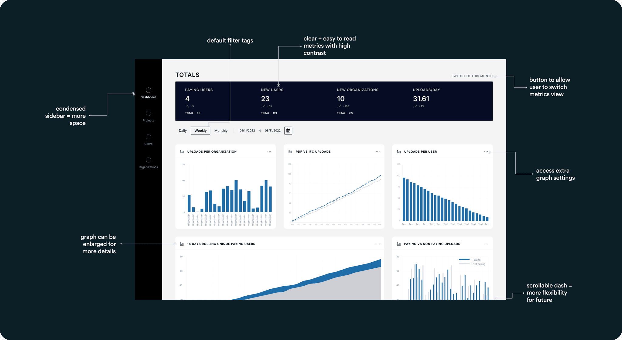
The final design came down to what was the easiest for users to navigate, provided the most important information up front, and allowed for scalability. The metrics in the top bar remained in a similar position to the current design, but with a higher contrast to instantly draw the user’s attention to it. The button just above allowed users to switch between metrics, allowing for more to be added when necessary. In the main body, the design of the date picker was improved and a few default filters were added, something highly requested from users. Meanwhile, the graphs each got their own individual card to distinguish between them more easily, and could be clicked on to open a modal where it could be viewed larger. The modal would also have additional filter tags.
The final design came down to what was the easiest for users to navigate, provided the most important information up front, and allowed for scalability. The metrics in the top bar remained in a similar position to the current design, but with a higher contrast to instantly draw the user’s attention to it. The button just above allowed users to switch between metrics, allowing for more to be added when necessary. In the main body, the design of the date picker was improved and a few default filters were added, something highly requested from users. Meanwhile, the graphs each got their own individual card to distinguish between them more easily, and could be clicked on to open a modal where it could be viewed larger. The modal would also have additional filter tags.


reflection
The experience of redesigning the admin panel was an extremely insightful one. Although I've communicated with users in the past and performed extensive research, in this situation, all the users wanted conflicting things and finding a fine line between was quite difficult. Furthermore, the technical constraint of needing to design something simple to implement meant I didn't have full creative freedom, as I often have had in the past.
However, it cemented the importance of user research for me, and taught me that keeping users involved in the design process throughout not only helps you, but truly eases the barrier towards creating great products.